Thursday, 30 May 2013

Blo November 12 Unresolved work

Version:1.0 StartHTML:0000000167 EndHTML:0000002596 StartFragment:0000000454 EndFragment:0000002580
BLOG November 2012

I had this wonderful picture of light, light as it has been used in architecture, I did not want to copy it but I wanted to get something from it. I started painting on a deep MDF frame, without planning -how it would work. I got so frustrated, the angles, the colours, the way the paint was applied.... and the board got sanded down, and painted over and sanded down and painted over each time slightly different but the problems were not being solved.


This image was from H Plummer, The architecture of Natural Light-The Refraction of light in a Diaphanous film

My images:


I think at this point I recognised that what I want to do was to make something that responded to the work of Toby Paterson, the way that I saw his work (as reproduced in his book-Consensus and Collapse). With clean, accurate lines, angles and bold colours.


I thought about how I could do this quickly sketching out ideas but just left it alone after this, I think because I recognised that I just had not the skill at present to develop this very neat clean lined work.

Is it right to stop working at something once the buzz has gone?

Blog  30 May2013

Toby Paterson


Since being introduced to the work of Toby Paterson I have been really interested in what he does, but I have yet to travel and see some of his work.  But over the last two years a great deal more of his work is being displayed via the internet and I find it most inspiring. It seems so clean, with clear colours, there is nothing that's not defined, his methods of presentation are interesting. I googled 'Toby Paterson -more images' to get a good selection to look at, I hope you will too because they are inspirational.


Blog: 30thMay 2013

Toby Paterson
http://www.themoderninstitute.com/artists/1/selected-solo-exhibitions
"An Experiment for Total Environment"
Durham Art Gallery Durham 2012


I would like you to visit this site, it will maybe
give you an understanding of what I wanted to do, with my vinyl on acrylic work of the Falmer Site Building last December.
 Inspired by Patersons' work, I made that image so that it could be viewed from the back or is it the front? anyway from both sides. This a great way to look at images and I regret not just getting on and doing it.

I consider Paterson has a very interesting way of looking at his subjects and an exciting way of presenting these to his audience.


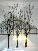
If you look closely at the image on the right you will see a shadow of a lightening struck tree behind the building.


Tuesday, 28 May 2013


Photographing my work


Tom Gates from City College Brighton took photographs of my work as I was unable to produce good images myself. I learnt so much from watching Tom working, about my work.  The way he was using lighting showed up things about my application of paint that I was not always aware of.  Things that I must be careful about in the future when painting. Sometimes I use a wash right at the end to even colour, but I need to make sure that the coverage is even.

 Lighting can reflect off work making it difficult to read and I need to think about that when working. The lights also show up every mark made that you don't want to be seen.  I was suprised when I put a coat of varnish over my work to help protect it, that house hold dust managed to rush at the surface and the fluff off my warm black wool jumper even more so!

Any other things you think I need to take more care over?

The night before the exhibition 21 May 2013

 Version:1.0 StartHTML:0000000167 EndHTML:0000004835 StartFragment:0000000454 EndFragment:0000004819
Blog The Exhibition 21 May 2012


This is how it is on Tuesday 21 May 2012. The final preparations are being made to the Summer 2013 show for FdA Fine Art and FdA Photography

The lower gallery is ready, the upper gallery approached by the staircase visible in the picture is still awaiting completion, will show many of the FdA Photography images, some of the work will be displayed upstairs along with Christine Thornton's and Sammy Hutton's work and some in this gallery space.


Elizabeth Smith 'There and not there' 1-8 and 9-16 Series 3

My 16 images describing mass in space and light, all unique experiences, revealing forms that belong somewhere, my starting point for this work was my reading around Le Corbusier work for my Contextual Studies.

'
Also in this Gallery space is PeterTierney's portrait “from Newhaven to Seaford' This lovely portrait is presented to show comparisons of different media; digital, colour and monochrome film available to the contemporary photographer. 
Siting well, with Alex's portraits of 'Ruairy'. For Alex the female nude and portraiture is a prominent theme. Major influences are of German expressionism.       


PeterTierney's portrait                                   
from Newhaven to Seaford

                                                                                                                     
                                                                                                                'Ruairi'   
                                                                                                                 Alexandra Burrows McGill                                                                                                                                                                   


'
  “Female Nudes and Portrait”
Alexandra Burrows McGill


 Sophie Ellistons Image sits outside the slightly larger studio space that I now understand was known as “Church”. In this area, 

 Emma O Neils' 'Whose woods these are?”  are displayed, 172 , 10cmx10cm images surround you as you enter. Emma seeks to describe the continuous change and temporality, alongside the permanence and stability that we encounter in nature.


                                                        Emma O Neils' 'Whose woods these are?”

So far so good, only a few more hours and we will know how our work has been received. There are more rooms to describe eg. 'A room of books' to accompany the show and in the top gallery further work,- this from Christine and Sammy along with more photography This will be in a later blog.

References: Many of the descriptions were available as part of the The Student Book 2013


BLOG Exhibition Evening 25May 2013

Version:1.0 StartHTML:0000000167 EndHTML:0000002700 StartFragment:0000000454 EndFragment:0000002684
Blog 25 May 2012


The exhibition, what a fabulous evening, the studios looked amazing, and as the gallery filled up and people were interested enough to asked about the work -it got even better. I was pleased that I used aspects of my essay as my inspiration and even more pleased that I had documented the relationship of each image in my book because I was able to speak confidently ( if not coherently) about each image and its relationship to the other images.

If I had planned them all more carefully in terms of what would be hung next to what, and the relationship of the images next to each other I would have paid more attention to the colour/tone of each image so that not only did they visually sit well together but they had a strong relationship to the next work. Something to think more about for the future.


It was a pity that the print room did not get the maps and postcards printed. I always like to go away with a keepsake or reminder of what I have seen at an exhibition. The cards we had printed last year were really great and I have sent them to people since, in fact I sent one on the 2nd of May this year.
Maybe something to think about is sign posting an event. “Reception” in the main tower block building told some people I know, that they were not even aware of the exhibition and had difficulties directing people to the event. I put directions to Trafalgar Court in with both my post and emailed invitations, we have to remember people forget to take these things with them, or possibly, like me and getting old and forget what we've read.

A big thank you to you all for covering for me in show building, I was very pleased to be in when I could but I know you guys really did all the graft!

BLOG December 2012 I saw a thunder storm in the making

Version:1.0 StartHTML:0000000167 EndHTML:0000002728 StartFragment:0000000454 EndFragment:0000002712
BLOG December 2012

I saw a thunder storm in the making

Just another one of those very slow bus journeys towards home, the sky darkening as we get into December and I see this wonderful angry purple sky as I look across the A23 and Falmer Railway Station towards the University, the sky lighting one of the Falmer buildings as something 'of the moment'.

For some nights after I twist and turn and stare as I past the same spot on the bus, and I looked for a number of nights following but could not match the image image in my head.
This amazing silver building, with clearly defined trees standing proud in front of the building?

I decided that I could work this image through, by using clear perspex sheets, and printed /cut vinyl images. I took photographs at the site and noway were the trees in front of the building but from the images I was able to identify the image I was carrying and the why the trees were where they were and it was down to the light on that night, that one moment in time.


There and not there”

Should I do more of this work? I like the clarity of the materials.

I have been hard pushed to manage this in time for the very long crit today and the seminar I had to present with Alex in the afternoon.

Blog 16May 2012 Changes to my proposal for the exhibition

Version:1.0 StartHTML:0000000167 EndHTML:0000001566 StartFragment:0000000454 EndFragment:0000001550
Blog 16May 2012

Instead of presenting my work as my “number one proposal” for the exhibition, Chris thinks my main work will be better hung in two rows of eight opposite the windows and I have to agree with him. Mostly they are quite difficult to read in good light. BUT that means I have to make another image, wow thats going to be a struggle, I started to feel that I had worked my way through this related work. Nothing at present is flowing, I cant afford the normal number of changes I make to my work nor the number of layers of paint that I put on, its got to be up on the wall on Monday, Tuesday at the latest. The two ideas that are with me relate to Unite Habitation, but that would mean days of blocking out and if paint penetrates where I don't want it to I will have real problems.

I am really anxious about not getting ideas at present, normally I get several a day for new work but blank now!

Blog: Info on Exhibition Proposal Easter Vacation 28March 2013

Version:1.0 StartHTML:0000000167 EndHTML:0000004675 StartFragment:0000000454 EndFragment:0000004659
Blog Info on Exhibition Proposal Easter Vacation 28March 2013

I think you have all seen my proposals, for the summer exhibition I submitted five different proposals , four involved work already done but wall paintings are to be added, as a background for the work. The wall painting, is inspired by Toby Paterson's style of presentation, I think, it brings a whole new dynamic to the work being displayed. I am writing here to provide greater detail to 'proposal one' which I intend to amend:

Proposal one was for 12/15 paintings to be hung as one work.

I am using my essay as my starting point and want to include ideas that have arisen, and are connected to Le Corbusier; the period and Modernist Architecture and now.

I intend to make fifteen acrylic paintings, on MDF Board frames, 40 x 40x 2cm. I intend to paint the wall area where the work will be hung with two right angle triangles as these were of great importance to Corbusier. He wrote 'A Poem to the Right Angle' a book of writings and images.

The wall painting bit is the Paterson inspiration. The fifteen paintings to hang in three rows of five with 10cm between each painting.

I hope to cover aspects including:

  • Le Corbusier's:
Villa Savoye this is a strong link to Le Corbusier, because the things that he held most dear to architecture at that time were reflected, e.g It was of modular design and highlights LCs five points .
Also important were: The right angle;the cube etc

  • The links made to Brutalism

  • I am interested in a number of buildings eg Habitat 67 which was built by Moshe Safdie as part of Canada's 1967 celebrations, (Expo 67) in someways an incredibly intricate building of units and St Peters Seminar, Scotland obsolete as it was finished and abandoned about ten years later, as the Catholic church changed its method of training. But these two choices undoubtedly will change, as I want to incorporate both concrete and glass into my painting and this may be difficult to communicate with the images I have of these two buildings.

  1. As reading about one person certainly leads to reading about many more I intend to include one architects vision from the 1930s which has been recently completed.

  • Also work that reflects the war torn years,

  • A number of late 20th and early 21st century buildings.

  • Further I need to link the style of work I am doing and am using titles provided from reading The Tate Gallerys information about John Varley 18th Century water colourist Monochrome 'The Blot'

Each image will be in Acrylic paint on MDF board 40x40x2cm , as identified in my proposal my work will occupy a space 2600mm x 1600mm, the middle row at eye level (I have allowed 10cm above below and to all sides as a minimum) for this work.

If you need confirmation of my other proposals I can now expand on these too.

BLOG Seminar December 2012

Version:1.0 StartHTML:0000000167 EndHTML:0000004719 StartFragment:0000000454 EndFragment:0000004703
BLOG Seminar December 2012


There is no longer any such thing as counter-culture

We have been asked to consider counter-cultural moments
and then
Discuss if this, (counter-culture) could happen now, or has the counter-cultural been absorbed and sold back to us as a commodity?


I had a file full of relevant papers, notes and our plan for our seminar today, we (Alex and I ) had read loads, Alex had bought a number of books and we had both prepared well , we knew how we were going to work, but I was held up and late in. I had all my notes and presentation plans with me, so that did not help Alex who started to work on the OHP side of things. We also had that incredibly long cold crit this morning that seemed to go on for hours, cutting short any time to gather our thoughts.

Everything was then too much of a rush and my mind really went blank. My rule for presentations let me down and I had to 'read the stuff', rather than talk about our bulleted points.

Like the morning crit, this too turned into a very long session, but I had, what can to a certain extent be termed a working knowledge of the era, and was able to respond and with Alex move the session forward as memories helped restore what had frozen up earlier.

I believe Alex and I through our research and reading had a substantial insight into the era of revolution, but counter cultural moments reveal themselves periodically, taking different forms in time; wars; industrial changes; votes for women; Gothic; tribal piercings and many more are all counter-cultural moments and reshape becoming absorbed as our culture changes, we have a very different society now, I think it unlikely that a massive movement that changes the course of art will be seen as society accepts and absorbs.


I was 20 in1968, I lived near to Crouch End, I had had, an unconditional place at Hornsey when I was 17, and many of my friends were there at the time of 'the revolution' that inspired and changed so much.

Blog October 2012 Belfort 1

Version:1.0 StartHTML:0000000167 EndHTML:0000002397 StartFragment:0000000454 EndFragment:0000002381

BLOG October 12

I have been looking at the work of architects and have found an interest in extracting ideas from their ideas. I have a number of books which show architectural work. Plans, buildings, lighting, and work artists have made to be included in the design either in the interiors or on or around exteriors
Jean Nouvel's Belfort Theatre provided the inspiration for my work on the right. I could see two wonderful curves in a picture showing the interior of the theatre, lit by light from the stage, the rest of the theatre just disappeared for me.

The colour came from the image , but I tried doing this in different colour ways but I kept coming back to the black background, I tried matt black board paint as well as acrylic paint. Initially I was disappointed with the way I had applied the background , it became thick and treacly, the brush strokes got thicker. So I started sanding down, again and yet again, then I realised that the curves were not right.

Once again the process of sanding down and re marking and re doing the curves took place and I had a very over worked piece to present.

The colours used were right, as a piece of work I prefer the left hand image with the chalk markings, for me the alteration has greater interest than that which I presented but I am also aware that I am still unhappy with the curves in the finished image -above on the right, and I think I should return to this work armed with better knowledge and re do it.

Blog 23 May2013 Picture to go with Belfort 2

I had photographs taken of my work by Tom Gates, what a great job he did, it was fascinating watching him work and make something of what he was reportedly supposed to have said about having to work with nothing there! I thought that was acceptable as these images are for my series 'there and not there (3)' Here is an image that links to my blog posting for Belfort 2 -10 May 2012

Can you see the white on white, I hope so, I am using the density of paint to project the image.

Blog 10 May 2013 Belfort 2

BLOG        Belfort-2 10 May 2013

As part of my "There and not There' series 3 made for the exhibition in May 2013, I've just painted white on white, and its made sense to me. I've re worked the curves I originally tried for my image Belfort 1, in October and November, nearly driving you all mad with the colour, line and position changes or requests for information on how to paint without making brush marks.

Shaun managed to move me forward in someways by suggesting blackboard paint and gloss paint, sadly that had a sense of failure as I tried them out on those cheap canvas things and both came out gloss, but not showing brush marks, so thank you Shaun. That is a way forward.

Now with the white on white, you can't see much anyway!- But it is not that easy, the white on white took nearly as long as the original to resolve and for me the top curve is not defined enough, nor is it as accurate as it really needs to be. One further problem, I am unable to take a successful photograph.
What am I to do about this?

April 2013- see it if you can Barocci at the National Gallery

Version:1.0 StartHTML:0000000167 EndHTML:0000002596 StartFragment:0000000630 EndFragment:0000002580

Barocci: Brilliance and Grace, at National Gallery


A perfectly sized exhibition of 'Religious Art' completely over awed me, it was not one I would have selected to see but now I know better. Barocci at the National Gallery, an open evening for students with a welcome glass of wine left me spell bound. His use of colour and the amazing ability of this incredible artist. Interested in finding out how artists apply paint and particularly in how they achieve 'smooth surfaces' it was pleasing to hear that Barocci technique was the simplest method 'finger painting'.

I hold in my mind the colours, they were so clear and bright, I have found it difficult to focus on my grey tones! For those of you working on portraits look at Barocci's self portrait - eyes are something special. I am sorry that I can not show here just how good they were.
I am really disappointed that I cannot post the pictures.


Blog 6th April 2013

Version:1.0 StartHTML:0000000167 EndHTML:0000002344 StartFragment:0000000454 EndFragment:0000002328
BLOG 6April 13

As part of my preparation for our end of FdA course exhibition I have been working on a number of paintings in grey tones, these relate to deconstructed buildings or abstracts. (2)

Here I have tried the lifting material for vinyl cuttings, its wrinkled because its on tracing paper to keep it intact but I did not use it as a stencil I cut a Frisket stencil from it. The Frisket stencil worked better than previously, the areas involved were much larger .

In the image below you can see how this worked on the top half. My original drawings were smaller and I did not like the balance in the enlarged work. I thought I would try adding more detail from the 'building' and because I only wanted vague images I
used torn paper, in fact this procedure worked really well but the 'whole work' did not come together.
I forgot to photograph the work at this stage which is a pity, I would have liked a record of the effect, I used a very thin Paynes Grey wash, which left a very nice jewel like navy blue residue.
The work however was very out of balance and very disappointing.
I have now made major changes and only the original stencil work can be seen on the surface.
AND this needs changing because the grey tone is wrong !
Where am I going wrong, why can't I get this right first time? Can you help?

Blog 4 April 2013

Version:1.0 StartHTML:0000000167 EndHTML:0000002452 StartFragment:0000000454 EndFragment:0000002436
BLOG 4April 13

As part of my preparation for our end of FdA course exhibition I have been working on a number of paintings in grey tones, these relate to deconstructed buildings or abstracts. (1)

I have planned and tested what I intended to make, using a new (to me) low tack product (Frisket) to make my stencil. This I tested in a smaller proportions and it seemed to work well in some cases and not in others.

Frisket, it seems is designed to be used with spray paint rather than roller or paint brush. This has in fact affected my plans as I had hoped to be able to move away from frog tape. I can make wider areas of masking with frog tape but overlap becomes difficult to cut and as a result a bleed can happen.

I spent quite a few hours measuring, cutting and applying Frisket for this work, satisfied that all the rectangles were straight etc I applied paint, the frisket moved and you can also see bleds, it is possible to remove some bleds by scrapping off or even removing with water but nothing can sort out the movement.
I think this was because of the surface texture which was not smooth, having been rolled on tends to be a little like sandpaper.

I have applied Frog tape where possible and the squewd background provides interest, but it is irritating to me.

I am not rushing, I try to work carefully, I measure, maybe colour mixing is not what it should be but what else should I be doing? I am not sure I want to work in the surface for ever but I would like to develop further the effects .

Blog- 20May 2013

Version:1.0 StartHTML:0000000167 EndHTML:0000003938 StartFragment:0000000454 EndFragment:0000003922
Blog 20 May 2013

The Extra Image

Extra image required- my daughter said “told you so , told you to make a spare!”

Process and no
“its not just a dumb way of making work ...without any craft....”David Batchelor 2009

I peeled the Frog tape off and the paint had leaked under it!

I had cut up frog tape so it was 40mm wide, lots and lots of frog tape, placed 30mm apart with the aid of tweezers and a ruler on a very dry surface, then I had divided it all by cutting areas away so that the effect of slatted blinds could be seen, each blind stopping at the end of another part of window.

I carefully pressed each length of tape down to be sure paint would not creep under. Oh the frog tape was all placed at an angle-that did not make the task any easier, and as the light came through the window I was trying to communicate, it changed direction so of course did the frog tape......
Three/ four layers of paint, not the usual number.

But the paint had leaked and the reason I think was: I had made an impression of trees into my background surface and because the surface was slightly uneven the tape had not held its resistance. The surface was not damp the underlying tree images were made two weeks ago and left.

The image was a slatted window through which you could just make out a tree in winter.

But the paint had leaked.
Under14hours left.


The slats of the windows had to go, so that the leaked paint would go, out came the sandpaper and off came the paint -

and another more interesting image (another tree which I thought I had sanded away before starting work.) emerged.

The painting changed, so did its balance and it stood out from its crowd.

What should I have done?

Monday, 27 May 2013

I am suprised at how many blogs I have written and stored over the past months, tonight it has taken me a long while to find my way back to this site so I can at least post them all.

I am sorry that you may have to try to make sense of them, as no doubt they will all have the same post date, but some go back as far as November 12 , they should follow in chronological order but I know they won't. Mostly each has a heading with a date. Hope that helps.